0x00 TOC
作业题目分析
底部选项卡实现
轮播图片实现
卡片式风格
Fragment 平板电脑适配
左右 ListView 实现
侧滑界面实现
顶部弹出菜单实现
顶部选项卡实现
后记
0x01 作业题目分析 最近 android UI 布置了期末作业,以前总是不写作业,总觉得那些作业重复性太强,浪费太多时间。还不如将写作业的时间用在思考上面。不过自己还是喜欢那种课程设计的作业,课程设计的作业较普通作业来说,可以学到不少知识,可以整理出很多东西。几个人做出一个课设总觉得是一件很酷的事情,不过哪有几个人,很多时间都是一个人在做。不仅是对以往知识的掌握的练习,还可以自由地进行一定的扩展。
本次的试题总共有四个题目,分别代表了不同的应用,后面会尽量使用谷歌官方的组件来进行实现。
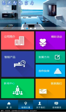
首先是模拟去哪儿网风格的卡片式手机客户端界面。
通过截图我们可以看到整体界面基本由三部分组成(第三幅图的标题栏可自行实现),底部由底部选项卡组成,上面是一个轮播图片组件,中间是一个类似于Win8的Merto风格的磁贴式风格。(题目上说下标签页,滑动导航,卡片式是什么鬼),这些基本就是这个试题的组成部分了,其他都是一些不重要或者很简单的东西了。
第二个是一个点菜应用界面设计。
看风格总像是一个在 iPad 上的应用,其中主要是以下几点:
1.设计成平板电脑横向应用(不可以旋转界面嘛)
2.界面实现左边菜谱分类导航,右边就是其分类下的菜品。这个就是意思是左边是一个 ListView,右边还是一个 ListView 或者 GridView,(当然都是 RecyclerView 也不反对),实际上截图上面左边是一个可扩展的ListView,这些不重要,重要的是右边内容是跟着左边的选项变化的。
3.关于详情介绍界面这个,把那个菜品对象传到另一个详情界面的 Activity,然后显示即可。以及选菜功能的话,这个其实有一点点复杂的,主要是选菜界面的部分,首先每个菜品上面需要有个单选框,来标记是否选择此菜品,选了以后,存到sharedprefences也好,数据库也罢,或者放到缓存里面,然后在我的已点菜界面可以查到相关信息。以及应该有个计算总价或者购物车的功能。
第三个是一个模拟手机QQ的界面,给出的截图也应该是5.x的版本,在以后的版本里,已经改回了侧滑菜单,不再有缩放效果。
上方的消息电话的切换效果,以前是用两张图片来切换的,然后中间内容是一个ViewPager控制下的Fragment,然后滑动一下,切换界面的时候,更改标题栏的图片。
这个题目需要有一个侧滑菜单,点击头像或者在左侧边缘部分向右滑动,可像抽屉似的出现一个菜单。
其他就是一些底部选项卡的,以及圆角头像,以及圆角头像的角标,弹出菜单的一些常规的东西了。
最后一个是一个新闻客户端,截图给了一个网易和凤凰视频的,两者结构上很相似,基本上是以下情况。
除去标题栏以后,一个顶部选项卡,(当然网易的还有沉浸式状态栏),然后一个轮播图片组件,一个ListView的新闻列表,(当然网易的还有一个垂直跑马灯效果的新闻组件),底部选项卡。
整体的这次课程设计就是这样子,实际上谷歌官方并不推荐这样布局的,谷歌有自己的设计语言Material Design ,在5.0以后会越来越多的应用采用这个(当然国内大厂没遵循规范,其实他们也做过相关实践的),比如一些知乎、Youtube类似的应用,早已开始了这种风格的实践,并且谷歌官方推出了不少关于它的组件,让一个不懂设计的开发,也能做出一个好看的界面,而传统的风格是碎片化的,有些应用借鉴了iOS的设计,形成了自己的风格,需要美工和开发者的不断配合。
对于现在来说,个人开发者对Material Design 熟悉一点比较好,不仅可以快速做出一些界面,还可以改善自己博客的风格。
0x02 底部选项卡实现 底部选项卡,在2.3时期,采用了TabHost和TabActivity的方式(即课本采用的方式),现在早已不是2.3时期了,TabActivity也已经过期了。在引入了Fragment以后,底部选项卡的设计也有所变化。
在Material Design里,也对底部导航栏进行了统一设计规范 ,该规范明确给出了 BottomNavigation在设计,使用,交互,风格和尺寸等的使用。
实现Tab功能的几种方式也有人总结过,在Android学习笔记:TabHost 和 FragmentTabHost 这篇文章也叙述了五种方法。
其中有种就是利用FragmentTabHost实现底部导航栏,在Activity里初始化的代码:
1
2
3
4
5
6
7
8
9
10
fragmentTabHost = (FragmentTabHost) findViewById(android.R.id.tabhost); radioGroup = (RadioGroup) findViewById(R.id.rg_tab); fragmentTabHost.setup(this , getSupportFragmentManager(), R.id.fl_content); int count = fragments.length;for (int i = 0 ; i < count; i++) { TabHost.TabSpec tabSpec = fragmentTabHost.newTabSpec(i + "" ).setIndicator(i + "" ); fragmentTabHost.addTab(tabSpec, fragments[i], null ); } radioGroup.setOnCheckedChangeListener(this ); fragmentTabHost.setCurrentTab(0 );
其中fragments是一个Fragment的数组,里面包含了标签卡的class。其中底部的按钮采用了RadioGroup的组件,标识其只能按下一个。并且实现其的选择改变的接口(OnCheckedChangeListener),然后里面需要使fragmentTabHost.setCurrentTab(0);设置对应的标签页。
1
2
private Class[] fragments = {HomeFragment.class, HomeFragment.class, HomeFragment.class, HomeFragment.class};
布局代码:
1
2
3
4
5
6
7
8
9
10
11
12
13
14
15
16
17
18
19
20
21
22
23
24
25
26
27
28
<android.support.v4.app.FragmentTabHost android:id="@android:id/tabhost" android:layout_width="match_parent" android:layout_height="wrap_content" android:visibility="gone"> </android.support.v4.app.FragmentTabHost > <RadioGroup android:id="@+id/rg_tab" android:layout_width="fill_parent" android:layout_height="55dp" android:layout_alignParentBottom="true" android:layout_gravity="bottom" android:gravity="bottom" android:orientation="horizontal"> <RadioButton android:id="@+id/rb_home" style="@style/RadioButtonBottomTab" android:checked="true" android:minHeight="40dp" android:drawableTop="@drawable/selector_main_tab_home" android:text="首页" /> <RadioButton android:id="@+id/rb_test" style="@style/RadioButtonBottomTab" android:drawableTop="@drawable/selector_main_tab_home" android:text="测试" /> ... </RadioGroup >
当然利用ViewPagerIndicator和PagerSlidingTabStrip也可以完成此功能,这里用了RadioButton。
1
2
3
4
5
6
7
8
9
10
11
12
13
14
15
//style.xml <style name ="RadioButtonBottomTab" > <item name ="android:layout_weight" > 1</item > <item name ="android:layout_width" > 0dp</item > <item name ="android:layout_height" > match_parent</item > <item name ="android:padding" > 2dp</item > <item name ="android:button" > @null</item > <item name ="android:layout_gravity" > center_vertical</item > <item name ="android:scaleType" > centerCrop</item > <item name ="android:textSize" > 14sp</item > <item name ="android:textColor" > @android:color/black</item > <item name ="android:gravity" > center</item > <item name ="android:background" > #ffffff</item > </style >
1
2
3
4
5
6
7
//selector_main_tab_home.xml <?xml version="1.0" encoding="utf-8"?> <selector xmlns:android ="http://schemas.android.com/apk/res/android" > <item android:drawable ="@mipmap/ic_home_fill" android:state_checked ="true" /> <item android:drawable ="@mipmap/ic_home" /> </selector >
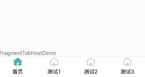
效果图如下:
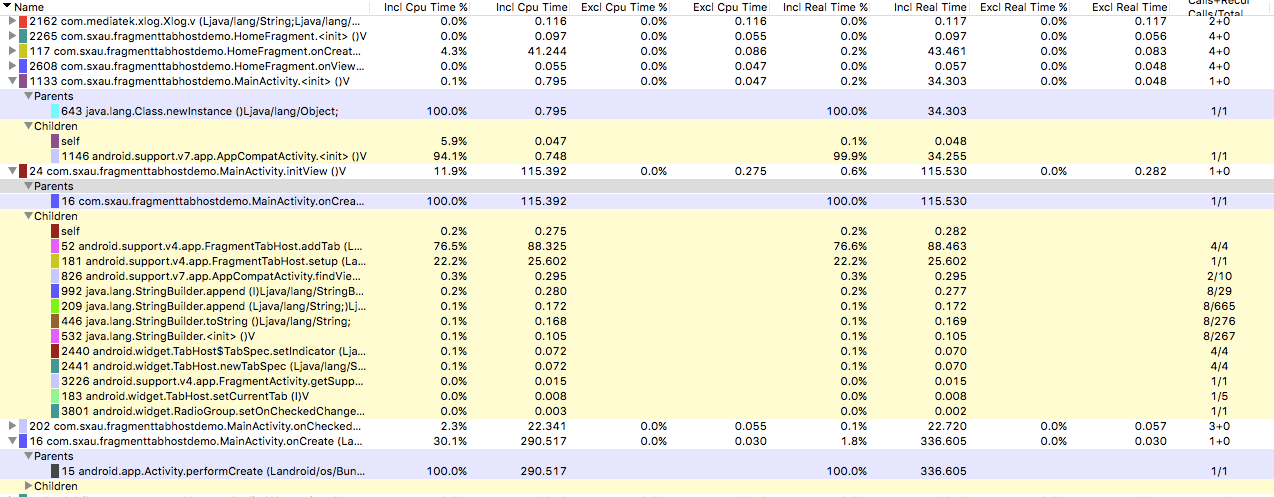
莫名地总想测一下时间,利用TraceView测试initView()(即初始化fragmentTabHost的代码)的结果如下:
0x03 轮播图片实现 这个轮播图片,这个好多大牛都自己实现过一次,如果时间不够,或者水平没达到一定程度,也可以借鉴一些开源组件,例如Kanner ,PictureCarousel 等。当然Trinea大牛也出过一篇名为Android自动滚动 轮播循环的ViewPager 的分析。 限于篇幅,不能详细地分析了。
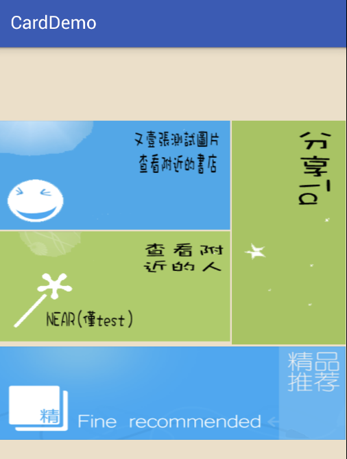
0x04 卡片式风格 事实上,截图里的风格趋近于磁贴,真正的卡片式设计谷歌也早已在应用 。但是这种交互性没有那么强,只有几个块状元素,应该触感上不如磁贴的。
因为没有什么特效,可以直接使用ImageView构建类似的风格,即如下图所示。
直接使用xml代码即可。
1
2
3
4
5
6
7
8
9
10
11
12
13
14
15
16
17
18
19
20
21
22
23
24
25
26
27
28
29
30
31
32
33
34
35
36
37
38
39
40
41
42
43
44
45
46
47
48
49
50
51
52
53
54
55
56
57
58
59
60
61
//activity_main.xml <?xml version="1.0" encoding="UTF-8"?> <LinearLayout xmlns:android ="http://schemas.android.com/apk/res/android" android:layout_width ="match_parent" android:layout_height ="match_parent" android:background ="#ffede0c8" android:orientation ="vertical" > <LinearLayout android:layout_width="match_parent" android:layout_height="match_parent" android:background="#ffede0c8" android:gravity="center" android:orientation="vertical" > <LinearLayout android:layout_width="match_parent" android:layout_height="wrap_content" android:orientation="vertical" > <LinearLayout android:layout_width="match_parent" android:layout_height="wrap_content" android:orientation="horizontal" > <LinearLayout android:layout_width="wrap_content" android:layout_height="wrap_content" android:layout_weight="2" android:orientation="vertical" > <ImageView android:id="@+id/c_joke" android:layout_width="match_parent" android:layout_height="wrap_content" android:layout_margin="1dp" android:scaleType="fitXY" android:src="@drawable/left_top" /> <ImageView android:id="@+id/c_idea" android:layout_width="match_parent" android:layout_height="wrap_content" android:layout_margin="1dp" android:scaleType="fitXY" android:src="@drawable/left_bottom" /> </LinearLayout > <ImageView android:id="@+id/c_constellation" android:layout_weight="1" android:layout_width="wrap_content" android:layout_height="wrap_content" android:layout_margin="1dp" android:scaleType="fitXY" android:src="@drawable/right" /> </LinearLayout > <ImageView android:id="@+id/iv_ad" android:layout_width="match_parent" android:layout_height="wrap_content" android:layout_margin="1dp" android:scaleType="fitXY" android:src="@drawable/bottom" /> </LinearLayout > </LinearLayout > </LinearLayout >
#####0x05 Fragment平板电脑适配
以及如何禁止旋转呢。
在新建项目的时候,选择Master/Detail Flow,然后运行到横向布局的平板上面,即是下图的效果。
它这里主要通过建立了layout-w900dp文件夹,来进行屏幕的适配,以及在java代码里面,通过以下判断,在Adapter里设定一个标志变量,以求响应不同的屏幕。
1
2
3
4
5
6
7
if (findViewById(R.id.item_detail_container) != null ) { mTwoPane = true ; }
禁止旋转的话,只需要在AndroidManifest.xml将对应的Activity的android:screenOrientation属性设为定值即可,比如纵向”portrait”,横向”landscape”。
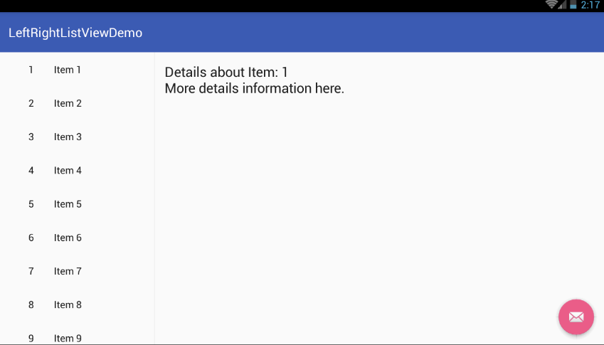
#####0x06 左右ListView实现
这个以前也做过类似的,类似于外卖平台的商家界面,左边是分类,而右边是该分类对应下的商品。当时做的是网络应用,分类和商品都是网络获取的,当然现在这个自己生成一些数据就好。
主要是有两个Adapter,一个分类的Adapter,即左边的Adapter,一个右边的Adapter。Adapter和传统的写法一致。
布局xml代码:
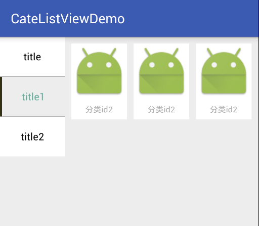
1
2
3
4
5
6
7
8
9
10
11
12
13
14
15
16
17
18
19
20
21
22
23
24
25
26
27
28
29
30
<LinearLayout android:layout_width="fill_parent" android:layout_height="fill_parent" android:background="#ededed" android:orientation="horizontal"> <ListView android:id="@+id/listView" android:layout_width="wrap_content" android:layout_height="wrap_content" android:layout_weight="3" android:background="@android:color/holo_green_dark" android:choiceMode="singleChoice" android:divider="@android:color/darker_gray" android:dividerHeight="1px" android:listSelector="@android:color/white"/> <GridView android:id="@+id/subListView" android:layout_width="match_parent" android:layout_height="match_parent" android:layout_margin="10dp" android:layout_marginTop="1dp" android:layout_weight="1" android:clipToPadding="false" android:horizontalSpacing="10dp" android:numColumns="3" android:verticalSpacing="10dp" /> </LinearLayout >
其中ListView和GridView是在一个LinearLayout里,响应listView的点击事件,然后加载不同的数据源,配置Adapter。
1 2 3 4 5 6 7 8 9 10 11 12 13 listView.setOnItemClickListener(new AdapterView.OnItemClickListener() { @Override public void onItemClick (AdapterView<?> arg0, View arg1, int position, long arg3) ClassList classList = datas.get(position); cate_id = classList.getGcId(); findCateById(cate_id); myAdapter.setSelectedPosition(position); myAdapter.notifyDataSetInvalidated(); subAdapter = new SubAdapter(MainActivity.this , subdatas); subListView.setAdapter(subAdapter); } });
0x07 侧滑界面实现 关于QQ的侧滑界面,网上也有解析 ,使用了ViewDragHelper来进行手势的处理。
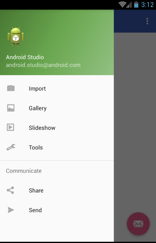
这个在新建项目的时候,我们就会发现一个名为Navigation Drawer Activity的选项。
我们可以选择它,一路Next。
然后运行应用,可以看到以下的效果。
分析这个应用的xml,整个界面的xml如下:
1 2 3 4 5 6 7 8 9 10 11 12 <android.support.v4.widget.DrawerLayout > <android.support.design.widget.CoordinatorLayout > <android.support.design.widget.AppBarLayout > <android.support.v7.widget.Toolbar /> </android.support.design.widget.AppBarLayout > <RelativeLayout > <TextView /> </RelativeLayout > <android.support.design.widget.FloatingActionButton /> <android.support.design.widget.CoordinatorLayout > <android.support.design.widget.NavigationView /> </android.support.v4.widget.DrawerLayout >
整体不难理解,是由一个DrawerLayout包含了整体的布局,然后CoodinatorLayout是界面的布局,而NavigationView是侧边栏导航的布局。其中DrawerLayout的文档里也说明了需要将primary content view作为第一个子节点,并且高度和宽度均为match_parent并且没有设置Layout_gravity,而抽屉需要在这个view之后,并设置layout_gravity,如果设置成start,即为从左向右滑动。
在java代码里,这个示例主要做了以下几件事情。
初始化并设置Toolbar
设置浮动按钮(FloatingActionButton)。
初始化DrawerLayout。由于ActionBarDrawerToggle实现了DrawerLayout.DrawerListener,所以直接使用其可以将DrawerLayout和ActionBar进行监听器的绑定。
初始化并配置NavigationView,其是谷歌标准的侧滑出来的布局,当然也可以自己实现一个布局,然后在Activity的xml布局里,在主内容之后添加。
其中menu也声明了是在activity_main_drawer.xml文件里,可以修改其,以进行一些侧滑菜单项的配置。
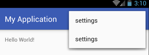
0x08 顶部弹出菜单实现 我们在侧滑界面实现的那个Demo或者Base Activity里面,其实已经实现了点击弹出菜单的样式,即官方实现,当然这个各自有各自的实现,我们当然也可以使用PopupMenu、PopupWindow之类的去实现这些效果,此次简要写一下官方实现Menu。
1 2 3 4 5 6 7 8 9 10 11 12 13 14 15 16 17 18 19 20 21 22 @Override public boolean onCreateOptionsMenu (Menu menu) getMenuInflater().inflate(R.menu.main, menu); return true ; } @Override public boolean onOptionsItemSelected (MenuItem item) int id = item.getItemId(); if (id == R.id.action_settings) { return true ; } return super .onOptionsItemSelected(item); }
1
2
3
4
5
6
7
8
9
10
//main.xml <?xml version="1.0" encoding="utf-8"?> <menu xmlns:android ="http://schemas.android.com/apk/res/android" xmlns:app ="http://schemas.android.com/apk/res-auto" > <item android:id="@+id/action_settings" android:orderInCategory="100" android:title="@string/action_settings" app:showAsAction="never" /> </menu >
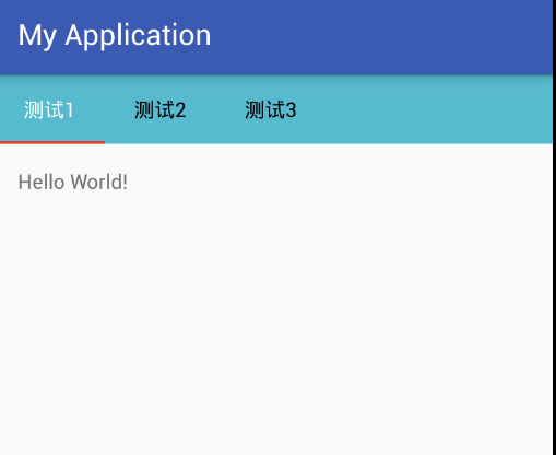
#####0x09 顶部选项卡实现
在build.gradle里引入
1 compile 'com.android.support:design:24.0.0'
1
2
3
4
5
6
7
8
9
10
11
12
13
14
15
16
17
18
//xml代码 <android.support.design.widget.TabLayout android:id="@+id/tabs" android:layout_width="match_parent" android:layout_height="48dp" //菜单高度 android:background="#1FBCD2" //菜单条的背景 app:tabIndicatorColor="#ff0000" //菜单指示器的颜色 app:tabMode="scrollable" //菜单可以滚动 app:tabPaddingEnd="20dp" app:tabPaddingStart="20dp" //菜单之间的间距 app:tabSelectedTextColor="#FFFFFF" //菜单选中时的颜色 app:tabTextColor="#000000"> //菜单未选中时的颜色 </android.support.design.widget.TabLayout > <android.support.v4.view.ViewPager android:id="@+id/vp_view" android:layout_width="match_parent" android:layout_height="wrap_content" />
1 2 3 4 5 6 7 8 9 10 11 12 13 14 15 16 17 18 19 20 21 22 23 24 25 26 27 28 29 30 31 32 33 34 35 36 37 38 39 40 41 42 43 44 45 46 47 48 49 50 51 52 53 54 55 56 57 58 59 60 61 62 63 64 65 private List<String> mTitleList = new ArrayList<String>();private View view1, view2, view3;private List<View> mViewList = new ArrayList<>();view1 = mInflater.inflate(R.layout.content, null ); view2 = mInflater.inflate(R.layout.content, null ); view3 = mInflater.inflate(R.layout.content, null ); mViewPager = (ViewPager) findViewById(R.id.vp_view); mTabLayout = (TabLayout) findViewById(R.id.tabs); mViewList.add(view1); mViewList.add(view2); mViewList.add(view3); mTabLayout.addTab(mTabLayout.newTab().setText(mTitleList.get(0 )), true ); mTabLayout.addTab(mTabLayout.newTab().setText(mTitleList.get(1 ))); mTabLayout.addTab(mTabLayout.newTab().setText(mTitleList.get(2 ))); MyPagerAdapter mAdapter = new MyPagerAdapter(mViewList); mViewPager.setAdapter(mAdapter); mTabLayout.setupWithViewPager(mViewPager); mTabLayout.setTabsFromPagerAdapter(mAdapter); class MyPagerAdapter extends PagerAdapter private List<View> mViewList; public MyPagerAdapter (List<View> mViewList) this .mViewList = mViewList; } @Override public int getCount () return mViewList.size(); } @Override public boolean isViewFromObject (View view, Object object) return view == object; } @Override public Object instantiateItem (ViewGroup container, int position) container.addView(mViewList.get(position)); return mViewList.get(position); } @Override public void destroyItem (ViewGroup container, int position, Object object) container.removeView(mViewList.get(position)); } @Override public CharSequence getPageTitle (int position) return mTitleList.get(position); } }
具体可以参考简书上的这篇Android开发之TabLayout实现顶部菜单的文章 。如果要实现内容不是View,而是一个Fragment的话,只需要重写一下Adapter,将对应的Fragment返回即可,具体可以查看FragmentStatePagerAdapter的源码,以及以前写过类似的东西 。
0x0A 后记 斜阳无限,无奈只一息间灿烂。
曾遇上几多风雨翻,编织我交错梦幻。
曾遇你真心的臂弯,伴我走过患难。
夕阳虽美,但却近黄昏。
梅艳芳曾经讲过,《夕阳之歌》是她一生的写照。也许在死亡面前,才能真正感悟。
各位都应珍惜时间,别到了最后,令自己后悔;珍惜眼前人,也许明日就是离别之时;珍惜身边的一切,经历过大风大浪才知,平淡美好的生活才是所向往的。未来怎样,无法预料,可是我们也得有面对未来的准备啊。扪心自问,问心无愧,足以。